파리바게트 사이트 레이아웃
✒️ 2025-05-16 13:02 내용 수정
실습 목표
- 파리바게트 웹 사이트의 구조와 동작을 확인하여 html과 css 코드를 작성한다.
- https://www.paris.co.kr/
- 실습에 사용한 글과 이미지는 모두 파리바게트 사이트에 있는 데이터다.
- 글과 이미지 모두 레이아웃 실습 용도로만 사용했다.
실습 흐름
- 웹 사이트의 html 구조를 확인하고, 구역별로 태그를 나누어 작성한다.
- 각 구역에 적용된 css를 작성한다.
- 반응형 웹 사이트 동작을 위한 미디어 쿼리를 추가한다.
파트별 코드
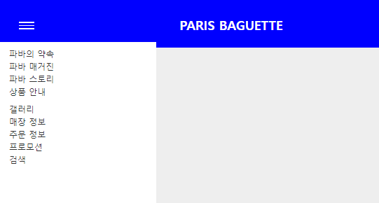
header
- html
<header class="header">
      <div class="inner">
        <h1 class="title"><a href="">PARIS BAGUETTE</a></h1>
        <button type="button" class="toggle-btn" id="toggle">
          <span></span>
          <span></span>
          <span></span>
        </button>
        <nav class="gnb">
          <div class="gnb-left">
            <span class="ls"><a href="#">파바의 약속</a></span>
            <span class="ls"><a href="#">파바 매거진</a></span>
            <span class="ls"><a href="#">파바 스토리</a></span>
            <span class="ls"><a href="#">상품 안내</a></span>
          </div>
          <div class="gnb-right">
            <span class="ls"><a href="#">갤러리</a></span>
            <span class="ls"><a href="#">매장 정보</a></span>
            <span class="ls"><a href="#">주문 정보</a></span>
            <span class="ls"><a href="#">프로모션</a></span>
            <span class="ls"><a href="#">검색</a></span>
          </div>
        </nav>
      </div>
    </header>
- css
- 상단 메뉴를 왼쪽 오른쪽 박스로 나누어 배치
- 특정 너비 이하에선 메뉴를 안보이게 하고, 버튼을 눌러야 메뉴가 나오도록 설정
/* common */
.content{width: 100%; padding: 24px;}
.inner{
    max-width: 1440px; margin: 0 auto;
    background-color: white;
}
@media screen and (max-width:1200px) {
    .inner{width: 100%;}
}
/* header */
.header{width: 100%; height: 90px; background-color: blue;}

.header .inner{
    margin: 0 auto; height: 100%;
    padding: 0 20px;
    position:relative;
    background: transparent;
}
.header .inner .title{
    display: block;
    width: 200px; height: 18px;
    position:absolute; left: 45%; top:25%;
    /* z-index:1; */
}
.header .inner .title a{
    width: 200px; height: 18px;
    font-size: 24px;
    line-height: 1.5;
    color:white;
}
.header .inner .toggle-btn{
    display:none;
    position:absolute; left:5%; top:40%;
    width: 30px; height: 25px;
    background-color: transparent; border: 0;
}
.header .toggle-btn span{
    display: block; width: 100%; height: 2px; margin: 4px 0;
    background-color: #fff;
}

.header .inner .gnb{
    height: 100%;
    display: flex; align-items: center;
    position:relative;
}
.header .inner .gnb-left{ width:50%; text-align: left; vertical-align: middle;}
.header .inner .gnb-left span a{color:#fff;}

.header .inner .gnb-right{width:50%; text-align: right;}
.header .inner .gnb-right span a{color:#fff;}

@media screen and (max-width:930px) {
    .header .inner{width:100%;}
    .header .inner .gnb{
        display:none; overflow:hidden;
        position: fixed; left:0; top:80px;
        width: 300px; height: 100%;
    }
    .header .inner .toggle-btn{display:block;}

    .header .inner .gnb-left{display:flex; flex-direction: column; margin:10px 20px;}

    .header .inner .gnb-right{display:flex; flex-direction: column; text-align: left; margin:10px 20px;}
    .header .inner .gnb-left span a{color:#333; line-height: 1.5;}
    .header .inner .gnb-right span a{color:#333; line-height: 1.5;}
}

.header .inner .gnb.active{
    display:block;
    background-color: #fff;
}
- javascript
let btn = document.getElementsByClassName("toggle-btn")[0];
let isOpen = false;
let menu = document.getElementsByClassName("gnb")[0];

btn.addEventListener("click", function () {
    isOpen = !isOpen;

    if (isOpen) {
        menu.classList.add('active');
    } else {
        menu.classList.remove('active');
    }
});

window.addEventListener('resize', function() {
    let windWidth = this.innerWidth;
    if (windWidth > 930) {
        menu.classList.remove('active');
    }
});

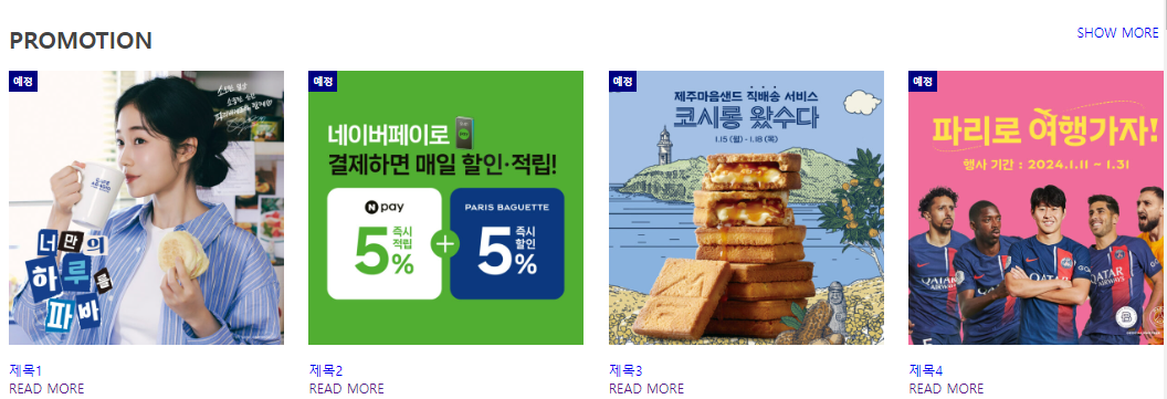
section 1
- html
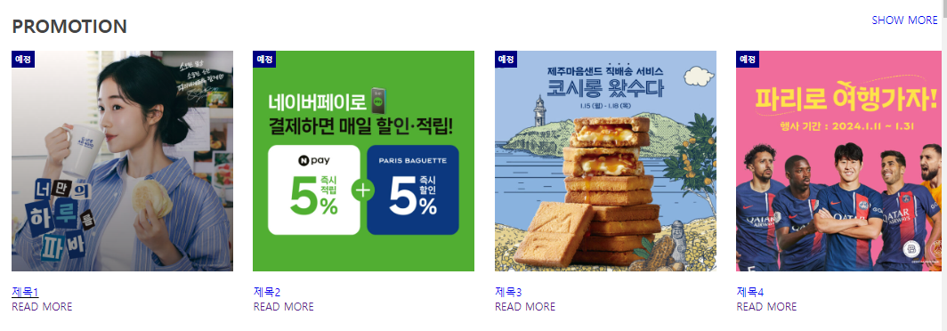
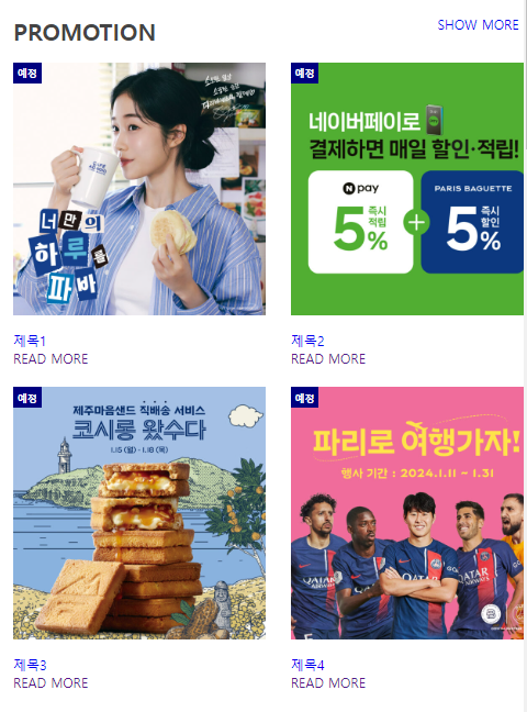
    <section class="promotion content">
      <div class="inner">
        <div class="title-wrap">
          <h2 class="title">PROMOTION</h2>
          <span class="info"><a href="#">SHOW MORE</a></span>
        </div>
        <div class="wrap">
          <div class="box">
            <a href="">
              <img src="../image/promo1.jpg" alt="#" />
              <span class="badge">예정</span>
            </a>
            <div class="post">
              <p class="post-title"><a href="#">제목1</a></p>
              <a href="">READ MORE</a>
            </div>
          </div>

          <div class="box">
            <a href="">
              <img src="../image/promo2.jpg" alt="#" />
              <span class="badge">예정</span>
            </a>
            <div class="post">
              <p class="post-title"><a href="#">제목2</a></p>
              <a href="">READ MORE</a>
            </div>
          </div>

          <div class="box">
            <a href="">
              <img src="../image/promo3.jpg" alt="#" />
              <span class="badge">예정</span>
            </a>
            <div class="post">
              <p class="post-title"><a href="#">제목3</a></p>
              <a href="">READ MORE</a>
            </div>
          </div>

          <div class="box">
            <a href="">
              <img src="../image/promo4.jpg" alt="#" />
              <span class="badge">예정</span>
            </a>
            <div class="post">
              <p class="post-title"><a href="#">제목4</a></p>
              <a href="">READ MORE</a>
            </div>
          </div>
        </div>
      </div>
    </section>
- css
- 마우스가 그림 위에 올라가면 그라데이션이 생기는 효과 적용
/* common */
.content{width: 100%; padding: 24px;}
.inner{
    max-width: 1440px; margin: 0 auto;
    background-color: white;
}
@media screen and (max-width:1200px) {
    .inner{width: 100%;}
}
.content .title{font: bold 1.75rem 'inherit'; color: #444;}
.content .inner .wrap{
    width:100%;
    display:flex; flex-direction: row; flex-wrap: wrap;
    justify-content: space-between;
    margin:0 auto;
}
.content .inner .title-wrap{
    display:flex; flex-direction: row; justify-content: space-between;
    margin: 20px 0;
}
.content .inner .title-wrap .info{margin-right:30px;}


/* promotion */
.promotion .box{position:relative; width: calc((100% - 30px * 3) / 4);}

@media screen and (max-width:1200px) {
    .promotion .box{width: calc((100% - 30px * 3) / 4);}
}

@media screen and (max-width:768px) {
    .promotion .box{width: calc((100% - 30px * 1) / 2); margin-bottom: 24px;}
}

@media screen and (max-width:480px) {
    .promotion .box{width: 100%;}
}

.promotion .box  > a{position: relative; color: #333; font-size: 18px; font-weight: bold;}
.promotion .box > a::after{
    content: ''; width: 100%; height: 100%;
    position: absolute; left:0; top:0;
    background: linear-gradient(to top, rgba(0, 0, 0, 0.5), transparent);
    transition:0.4s; opacity:0;
}
.promotion .box:hover > a::after{opacity:1;}

.promotion .box a img{ width: 100%; display:block;}
.promotion .box a .badge{
    position:absolute; left:0; top:0; padding: 5px;
    background-color: navy; color:#fff;
    font-size: 12px;
}
.promotion .box .post{margin-top: 20px;}
.promotion .box:hover .post .post-title{text-decoration:underline black;}
section 2
- html
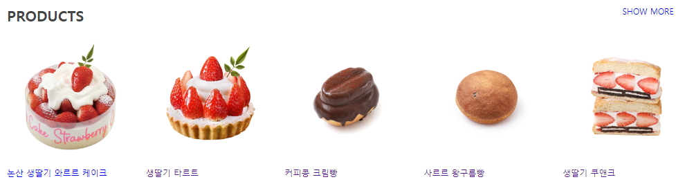
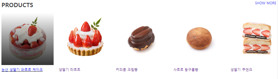
    <section class="products content">
      <div class="inner">
        <div class="title-wrap">
          <h2 class="title">PRODUCTS</h2>
          <span class="info"><a href="#">SHOW MORE</a></span>
        </div>
        <div class="wrap">
          <div class="box">
            <a href="#" class="pic">
              <img src="../image/논산생딸기.png" alt=""/>
            </a>
            <div class="post">
              <p class="post-title">
                <a href="#">논산 생딸기 와르르 케이크</a>
              </p>
            </div>
          </div>

          <div class="box">
            <a href="#" class="pic">
              <img src="../image/생딸기-프렌치.jpg" alt="" />
            </a>
            <div class="post">
              <p class="post-title"><a href="">생딸기 타르트</a></p>
            </div>
          </div>

          <div class="box">
            <a href="#" class="pic">
              <img src="../image/커피콩크림빵.jpg" alt="" />
            </a>
            <div class="post">
              <p class="post-title"><a href="">커피콩 크림빵</a></p>
            </div>
          </div>

          <div class="box">
            <a href="#" class="pic">
              <img src="../image/사르르왕구름빵.jpg" alt="" />
            </a>
            <div class="post">
              <p class="post-title"><a href="">사르르 왕구름빵</a></p>
            </div>
          </div>

          <div class="box">
            <a href="#" class="pic">
              <img src="../image/쿠앤크-딸기-샌드.png" alt="" />
            </a>
            <div class="post">
              <p class="post-title"><a href="">생딸기 쿠앤크</a></p>
            </div>
          </div>
        </div>
      </div>
    </section>
- css
- 마우스가 그림 위에 올라가면 그라데이션이 생기는 효과 적용
/* common */
.content{width: 100%; padding: 24px;}
.inner{
    max-width: 1440px; margin: 0 auto;
    background-color: white;
}
@media screen and (max-width:1200px) {
    .inner{width: 100%;}
}
.content .title{font: bold 1.75rem 'inherit'; color: #444;}
.content .inner .wrap{
    width:100%;
    display:flex; flex-direction: row; flex-wrap: wrap;
    justify-content: space-between;
    margin:0 auto;
}
.content .inner .title-wrap{
    display:flex; flex-direction: row; justify-content: space-between;
    margin: 20px 0;
}
.content .inner .title-wrap .info{margin-right:30px;}


/* product */
.products .box{width: calc((100% - 24px * 4) / 5);}

.products .box a.pic{position:relative; display: block;}
.products .box .pic img{display:block; width: 100%;}
.products .box p{margin-top: 10px; color:black;}

.products .box > a::after{
    content:''; width: 100%; height: 100%;
    position: absolute; left: 0; top: 0;
    background: linear-gradient(to top, rgba(0,0,0,0.8), transparent);
    transition: 0.4s; opacity:0;
}

.products .box > a:hover::after{opacity: 1;}
.products .box:hover p{text-decoration: underline black;}

@media screen and (max-width:768px) {
    .products .box{width: calc((100% - 24px * 3) / 4); margin-bottom: 24px;}
}
section 3
- html
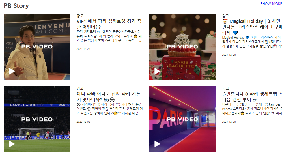
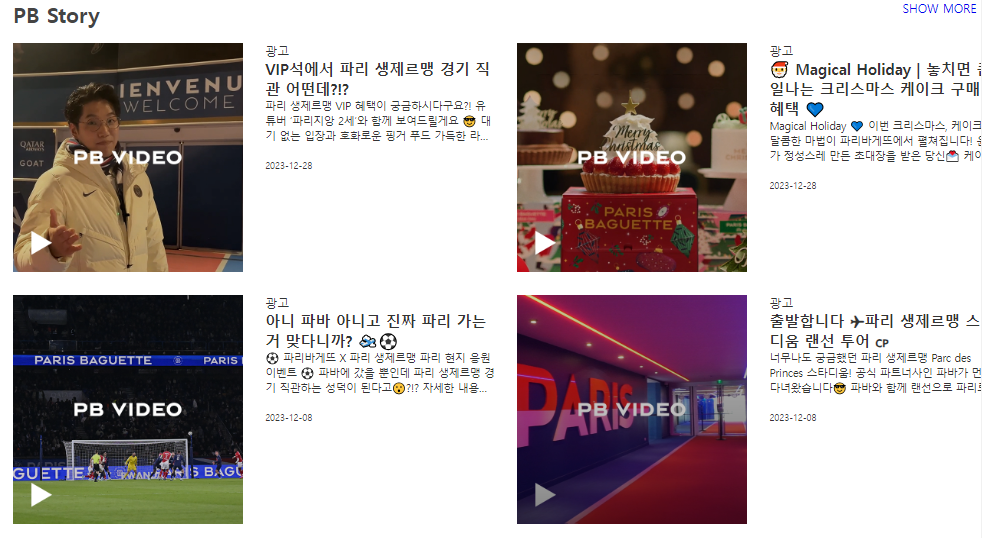
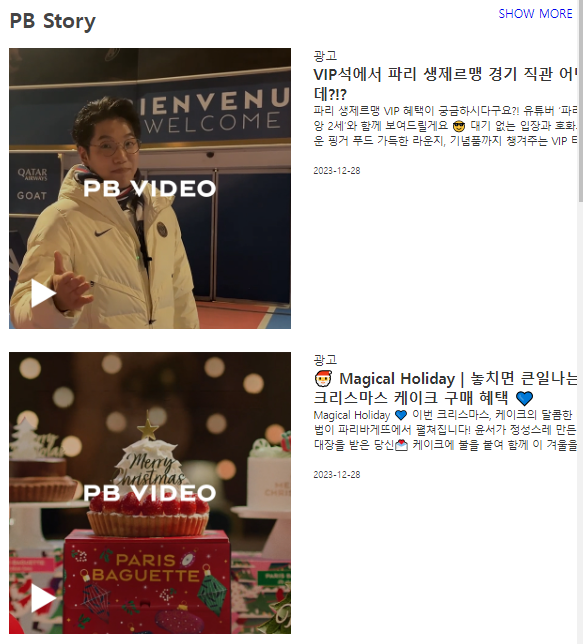
    <section class="pb-story content">
      <div class="inner">
        <div class="title-wrap">
          <h2 class="title">PB Story</h2>
          <span class="info"><a href="#">SHOW MORE</a></span>
        </div>
        <div class="wrap">
          <div class="box">
            <a href="#" class="pic"><img src="../image/pb-story-1.jpg" alt=""/></a>
            <a href="#" class="desc">
              <p class="post-category">광고</p>
              <h3 class="post-title">
                <strong>VIP석에서 파리 생제르맹 경기 직관 어떤데?!?</strong>
              </h3>
              <p class="post-excerpt">
                파리 생제르맹 VIP 혜택이 궁금하시다구요?! 유튜버 ‘파리지앙
                2세’와 함께 보여드릴게요 😎 대기 없는 입장과 호화로운 핑거 푸드
                가득한 라운지, 기념품까지 챙겨주는 VIP 티켓 그래서 어떻게
                받냐구요😮?!?
              </p>
              <p class="post-date">2023-12-28</p>
            </a>
          </div>

          <div class="box">
            <a href="#" class="pic"><img src="../image/pb-story-2.jpg" alt=""/></a>
            <a href="#" class="desc">
              <p class="post-category">광고</p>
              <h3 class="post-title">
                <strong
                  >🎅 Magical Holiday | 놓치면 큰일나는 크리스마스 케이크 구매
                  혜택 💙</strong
                >
              </h3>
              <p class="post-excerpt">
                Magical Holiday 💙 이번 크리스마스, 케이크의 달콤한 마법이
                파리바게뜨에서 펼쳐집니다! 윤서가 정성스레 만든 초대장을 받은
                당신💌 케이크에 불을 붙여 함께 이 겨울을 밝혀주세요❣
              </p>
              <p class="post-date">2023-12-28</p>
            </a>
          </div>

          <div class="box">
            <a href="#" class="pic"><img src="../image/pb-story-3.jpg" alt=""/></a>
            <a href="#" class="desc">
              <p class="post-category">광고</p>
              <h3 class="post-title">
                <strong
                  >아니 파바 아니고 진짜 파리 가는거 맞다니까? 🛫⚽</strong
                >
              </h3>
              <p class="post-excerpt">
                ⚽ 파리바게뜨 X 파리 생제르맹 파리 현지 응원 이벤트 ⚽ 파바에
                갔을 뿐인데 파리 생제르맹 경기 직관하는 성덕이 된다고😮?!?
                자세한 내용은 파리바게뜨 홈페이지와 파바앱에서 확인해 주세요💙
              </p>
              <p class="post-date">2023-12-08</p>
            </a>
          </div>

          <div class="box">
            <a href="#" class="pic"><img src="../image/pb-story-4.jpg" alt=""/></a>
            <a href="#" class="desc">
              <p class="post-category">광고</p>
              <h3 class="post-title">
                <strong>출발합니다 ✈파리 생제르맹 스타디움 랜선 투어 🇨🇵</strong>
              </h3>
              <p class="post-excerpt">
                너무나도 궁금했던 파리 생제르맹 Parc des Princes 스타디움! 공식
                파트너사인 파바가 먼저 다녀왔습니다😎 파바와 함께 랜선으로
                파리로 떠나보아요💙
              </p>
              <p class="post-date">2023-12-08</p>
            </a>
          </div>
        </div>
      </div>
    </section>
- css
- 마우스가 그림 위에 올라가면 그라데이션이 생기는 효과 적용
- 텍스트가 특정 라인 수보다 길면 말 줄임표 표시로 숨기는 효과를 설정
/* common */
.content{width: 100%; padding: 24px;}
.inner{
    max-width: 1440px; margin: 0 auto;
    background-color: white;
}
@media screen and (max-width:1200px) {
    .inner{width: 100%;}
}
.content .title{font: bold 1.75rem 'inherit'; color: #444;}
.content .inner .wrap{
    width:100%;
    display:flex; flex-direction: row; flex-wrap: wrap;
    justify-content: space-between;
    margin:0 auto;
}
.content .inner .title-wrap{
    display:flex; flex-direction: row; justify-content: space-between;
    margin: 20px 0;
}
.content .inner .title-wrap .info{margin-right:30px;}


/* pb-story */
.pb-story .box{
    width: calc((100% - 30px * 1) / 2); margin: 0 0 30px;
    display: flex; justify-content: space-between; flex-wrap:wrap;
}

.pb-story .box a{
    display: block; width: calc((100% - 30px * 1) / 2);
    color:#333;
}

@media screen and (max-width:1024px) {
    .pb-story .box{width: 100%;}
}

@media screen and (max-width:768px) {
}

@media screen and (max-width:480px) {
    .pb-story .box a{width: 100%; margin-bottom: 30px;}
}

.pb-story .box a img{width: 100%; display: block;}
.pb-story .box a .post-category{max-width: 0 0 20px;}
.pb-story .box a .post-title{max-width: 0 0 20px; font-size: 20px;}
.pb-story .box a .post-excerpt{
    max-width: 0 0 20px; font-size: 14px;
    margin-bottom: 20px; line-height: 20px;
    display: -webkit-box; /* -webkit-box로 설정*/
    -webkit-line-clamp:3; /* 텍스트 라인 수 조절 */
    -webkit-box-orient: vertical; /* 배치 방법 */
    overflow: hidden;
}
.pb-story .box a .post-date{font-size: 12px;}

.pb-story .box a .post-category:hover{text-decoration: underline;}
.pb-story .box a .post-title:hover{text-decoration: underline;}
.pb-story .box a .post-excerpt:hover{text-decoration: underline;}

.pb-story .box a.pic{position:relative;}

.pb-story .box a.pic::after{
    content:''; position: absolute; left: 0; top:0;
    width: 100%; height: 100%;
    background: linear-gradient(to top, rgba(0,0,0,0.5), transparent);
    opacity:0;
    transition:0.3s;
}
.pb-story .box a.pic:hover::after{opacity:1;}
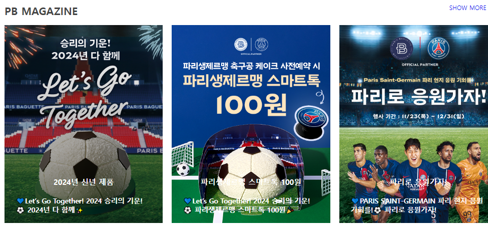
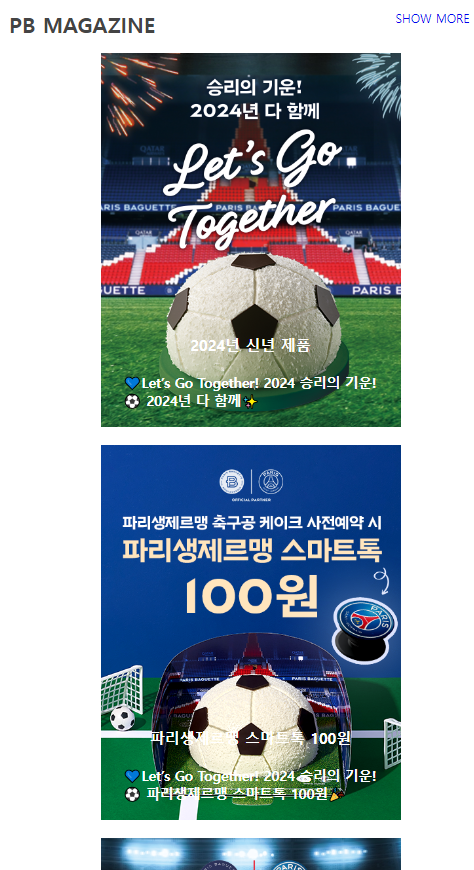
section 4
- html
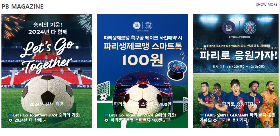
    <section class="magazine content">
      <div class="inner">
        <div class="title-wrap">
          <h2 class="title">PB MAGAZINE</h2>
          <span class="info"><a href="#">SHOW MORE</a></span>
        </div>
        <div class="wrap">
          <div class="box">
            <a href="#">
              <img src="../image/magazine1.png" alt="2024년 신년 제품" />
            </a>
            <div class="post">
              <p class="post-title"><a href="#">2024년 신년 제품</a></p>
              <a href="#" class="read_more">💙Let’s Go Together! 2024 승리의 기운!⚽ 2024년 다 함께✨</a>
            </div>
          </div>
          <div class="box">
            <a href="#">
              <img
                src="../image/magazine2.png"
                alt="파리생제르맹 스마트톡 100원"
              />
            </a>
            <div class="post">
              <p class="post-title">
                <a href="#">파리생제르맹 스마트톡 100원</a>
              </p>
              <a href="#" class="read_more">💙Let’s Go Together! 2024 승리의 기운!⚽ 파리생제르맹 스마트톡 100원🎉</a>
            </div>
          </div>
          <div class="box">
            <a href="#">
              <img src="../image/magazine3.png" alt="파리로 응원가자!" />
            </a>
            <div class="post">
              <p class="post-title"><a href="#">파리로 응원가자!</a></p>
              <a href="#" class="read_more">💙PARIS SAINT-GERMAIN 파리 현지 응원 기회를!⚽ 파리로 응원가자!</a>
            </div>
          </div>
        </div>
      </div>
    </section>
- css
- 마우스가 그림 위에 올라가면 그라데이션이 생기는 효과 적용
- 텍스트가 그림 위로 올라오고, 마우스가 그림 위로 올라왔을 때 그라데이션에 글자가 가려지지 않도록 자식 요소(글자)에 z-index를 설정
/* common */
.content{width: 100%; padding: 24px;}
.inner{
    max-width: 1440px; margin: 0 auto;
    background-color: white;
}
@media screen and (max-width:1200px) {
    .inner{width: 100%;}
}
.content .title{font: bold 1.75rem 'inherit'; color: #444;}
.content .inner .wrap{
    width:100%;
    display:flex; flex-direction: row; flex-wrap: wrap;
    justify-content: space-between;
    margin:0 auto;
}
.content .inner .title-wrap{
    display:flex; flex-direction: row; justify-content: space-between;
    margin: 20px 0;
}
.content .inner .title-wrap .info{margin-right:30px;}


/* pb magazine */
.magazine .box{width: calc((100% - 24px * 2) / 3); position: relative;}
.magazine .box > a{
    position:relative;
    width: 100%; display: block;
}

/*
가상요소 우선순위
::after > ::before > 원본 요소 : 부모

img 태그는 ::before와 ::after를 만들지 못함
- 닫는 태그가 있는 경우엔 내용을 넣을 수 있고, 자식이 존재할 수 있음
*/

.magazine .box::after{
    content:''; width: 100%; height: 100%;
    position: absolute; left:0; top:0;
    background: linear-gradient(to top, rgba(0,0,0,0.5), transparent);
    opacity:0;
    transition: 0.3s;
}

.magazine .box:hover::after{opacity: 1;}

.magazine .box a img{width: 100%; display: block;}
.magazine .box .post{
    position:absolute; left:0; top:0; z-index: 1;
    width: 100%; height: 100%;
    display: flex; flex-direction: column;
    justify-content: flex-end; align-items: center;
    color:#fff;
}

@media screen and (max-width:1024px) {
    .magazine .inner .wrap{justify-content: space-around;}
    .magazine .box{ width: calc((100% - 24px * 1) / 2); margin-bottom: 24px;}
}

@media screen and (max-width:768px) {
    .magazine .box{ width: 100%; max-width: 400px;}
}

@media screen and (max-width:480px) {
}

.magazine .box .post a{color:#fff; font-weight: bold; padding:24px 30px;}
.magazine .box .post .post-title{font-size: 20px;}
.magazine .box .post .read_more{font-size: 18px; color: #fff; }
section 5
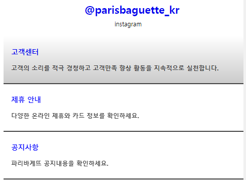
- html
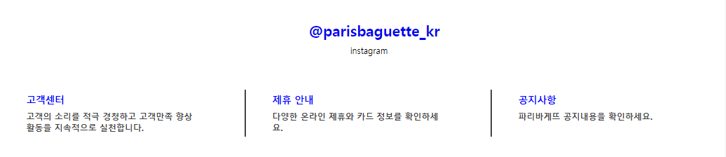
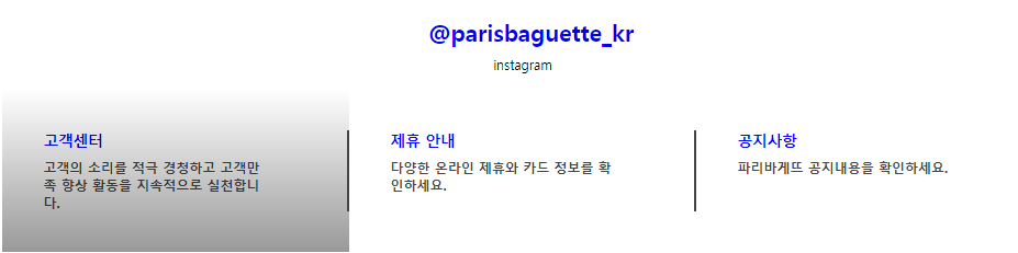
    <section class="sns content">
      <div class="inner">
        <div class="title-wrap">
          <h2 class="title"><a href="#">@parisbaguette_kr</a></h2>
          <span class="subtitle">instagram</span>
        </div>
        <div class="wrap">
          <div class="box">
            <a href="#" class="item">
              <h3 class="title">고객센터</h3>
              <p>고객의 소리를 적극 경청하고 고객만족 향상 활동을 지속적으로 실천합니다.</p>
            </a>
          </div>
          <div class="box">
            <a href="#" class="item">
              <h3 class="title">제휴 안내</h3>
              <p>다양한 온라인 제휴와 카드 정보를 확인하세요.</p>
            </a>
          </div>
          <div class="box">
            <a href="#" class="item">
              <h3 class="title">공지사항</h3>
              <p>파리바게뜨 공지내용을 확인하세요.</p>
            </a>
          </div>
        </div>
      </div>
    </section>
- css
- 마우스가 그림 위에 올라가면 그라데이션이 생기는 효과 적용
- 박스 사이에 구분선 바를 추가
/* common */
.content{width: 100%; padding: 24px;}
.inner{
    max-width: 1440px; margin: 0 auto;
    background-color: white;
}
@media screen and (max-width:1200px) {
    .inner{width: 100%;}
}
.content .title{font: bold 1.75rem 'inherit'; color: #444;}
.content .inner .wrap{
    width:100%;
    display:flex; flex-direction: row; flex-wrap: wrap;
    justify-content: space-between;
    margin:0 auto;
}
.content .inner .title-wrap{
    display:flex; flex-direction: row; justify-content: space-between;
    margin: 20px 0;
}
.content .inner .title-wrap .info{margin-right:30px;}


/* sns */
.sns .inner .title-wrap{display: block; width: 100%; text-align: center;}
.sns .title-wrap .title{margin: 10px;}
.sns .title{width: 100%;}

.sns .box{position:relative; width: 33.3333%;}
.sns .box .item{position:relative; display: block; padding:50px 100px 50px 50px;}
.sns .box .item .title{text-align: left; margin:0 0 10px; font-size: 18px; color:blue;}
.sns .box .item p{font-weight: bold; color:#444;}

.sns .box::after{
    content:''; display:block;
    width: 2px; height: 50%;
    position: absolute; right:0; top:25%;
    background-color: #444;

}

@media screen and (max-width:1024px) {
    .sns .box{width: 100%;}
    .sns .box .item .title{margin:0 0 20px;}
    .sns .box .item{padding:30px 20px;}
    .sns .box::after{
        width: 100%; height: 2px;
        right:0; top:100%;
    }
}

.sns .wrap .item::after{
    content:'';
    width: 100%; height: 100%;
    position: absolute; left:0; top:0;
    background: linear-gradient(to top, rgba(0,0,0,0.4), transparent);
    opacity: 0;
    transition: 0.3s;
}

.sns .wrap .item:hover::after{opacity: 1;}
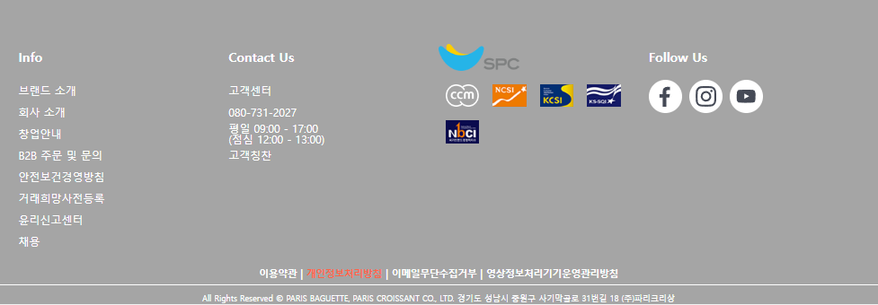
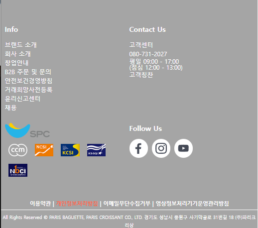
footer
- html
    <footer class="footer">
      <div class="inner">
        <div class="info box">
          <ul class="list">
            <li><h3 class="list-title">Info</h3></li>
            <li><a href="">브랜드 소개</a></li>
            <li><a href="">회사 소개</a></li>
            <li><a href="">창업안내</a></li>
            <li><a href="">B2B 주문 및 문의</a></li>
            <li><a href="">안전보건경영방침</a></li>
            <li><a href="">거래희망사전등록</a></li>
            <li><a href="">윤리신고센터</a></li>
            <li><a href="">채용</a></li>
          </ul>
        </div>
        <div class="contact box">
          <ul class="list">
            <li><h3 class="list-title">Contact Us</h3></li>
            <li><a href="">고객센터</a></li>
            <li>080-731-2027</li>
            <li><p>
                  <span>평일 09:00 - 17:00</span>
                  <span>(점심 12:00 - 13:00)</span>
                </p>
            </li>
            <li><a href="">고객칭찬</a></li>
          </ul>
        </div>
        <div class="logo box">
          <div class="pic-title">
            <a href=""><img src="../image/logo1.png" alt=""></a>
          </div>
          <div class="pic">
            <a href=""><img src="../image/logo2.png" alt=""></a>
            <a href=""><img src="../image/logo3.png" alt=""></a>
            <a href=""><img src="../image/logo4.png" alt=""></a>
            <a href=""><img src="../image/logo5.png" alt=""></a>
            <a href=""><img src="../image/logo6.png" alt=""></a>
          </div>
        </div>
        <div class="sns box">
          <div class="list">
            <h3 class="list-title">Follow Us</h3>
            <div class="pic">
              <a href=""><img src="../image/sns_ico_01.svg" alt=""></a>
              <a href=""><img src="../image/sns_ico_02.svg" alt=""></a>
              <a href=""><img src="../image/sns_ico_03.svg" alt=""></a>
            </div>
          </div>
        </div>
      </div>
      <div class="menu">
        <ul class="menu-footer">
          <li><span>이용약관</span></li>
          <li><span>개인정보처리방침</span></li>
          <li><span>이메일무단수집거부</span></li>
          <li><span>영상정보처리기기운영관리방침</span></li>
        </ul>
        <div class="copyright">
          <span >All Rights Reserved © PARIS BAGUETTE, PARIS CROISSANT CO., LTD. 경기도 성남시 중원구 사기막골로 31번길 18 (주)파리크리상</span>
        </div>
      </div>
    </footer>
- css
- ul 항목을 가로로 배치하고, li 항목 사이에 구분선 바를 추가
- 이미지를 박스에 넣고 박스의 테두리를 변경하여 원형 아이콘처럼 변경
/* footer */
.footer{background-color: #a5a5a5;}
.footer .inner {
    width:100%;
    display:flex; flex-direction: row; flex-wrap: wrap;
    justify-content: center;
    margin:0 auto;
    padding: 70px 0 20px;
    background-color: transparent;
}

.footer .box{width:calc((100% - 20px * 3) / 4); line-height: 2;}
.footer .list .list-title{padding-bottom: 15px;}

@media screen and (max-width:1024px) {
    .footer .box{
        width:calc((100% - 20px * 1) / 2); line-height: 1.5;
        margin-bottom: 30px;
    }
}

.footer .list{color: #fff;}
.footer .list a{color:#fff;}

.footer .contact .list span{display: block; line-height: 1;}

.footer .logo .pic-title img{width: 120px;}
.footer .logo .pic{
    display: flex; flex-direction: row; justify-content: flex-start; flex-wrap: wrap;
}
.footer .logo .pic a img{display: block;  width: 50px; height: 34px; margin:10px;}

.footer .sns .pic{display: flex; justify-content: flex-start; align-items: center;}
.footer .sns .pic a{
    display: block; width:50px; height:50px; margin-right: 10px; border-radius: 50%; background-color: white;
    position: relative;
}

.footer .sns .pic a img{
    display: block; width: 60%; height: 60%;
    position: absolute; left: 20%; top:20%;
}

.footer .menu-footer{
    display: flex; justify-content: center; flex-wrap: wrap;
    margin: 0 0 7px;
}
.footer .menu-footer span{
    font: bold 14px 'inherit'; color:#fff;
    position:relative;
}

.footer .menu-footer span::after{
    content:'|'; color:#fff;
    margin:0 5px;
}
.footer .menu-footer li:last-of-type span::after{display:none}
.footer .menu-footer li:nth-of-type(2) span{color:tomato;}

.footer .menu .copyright{
    text-align: center; border-top: 1px solid #fff; padding-top: 7px;

}

.footer .menu .copyright span{font-size: 12px; color:#fff;}