flexbox
✒️ 2025-05-16 12:37 내용 수정
flexbox 적용 테스트 : Test Css Flexbox Rules, flexbox froggy, FlexGrid
참고 자료 : Quackit Flexbox Alignment, align-items/align-content/align-self의 특징과 차이점, stackoverflow What's the difference between align-content and align-items?, Inflearn align-items vs align-content, mdn web docs order, samanthaming space-around vs space-evenly
기타 참고 사이트 : 1분코딩 Flexbox,
display: flex;로 적용했을 때 요소들의 배치를 설정한다.- 부모 요소에 적용하며, 하위 요소를 원하는 방향으로 나란히 배치할 수 있다.
div{
	display: flex;
	justify-content: center;
	align-items: center;
}
| 속성 | 속성값 | 설명 |
|---|---|---|
flex-direction |
flex로 나란히 배치할 방향 설정 | |
row |
기본 설정. 가로로 나란히 배치 | |
| 기본 크기 설정 시 너비는 자신의 크기, 높이는 부모의 크기 적용 | ||
row-reverse |
가로로 역순 배치 | |
col |
세로로 배치 | |
col-reverse |
세로로 역순 배치 | |
justify-content |
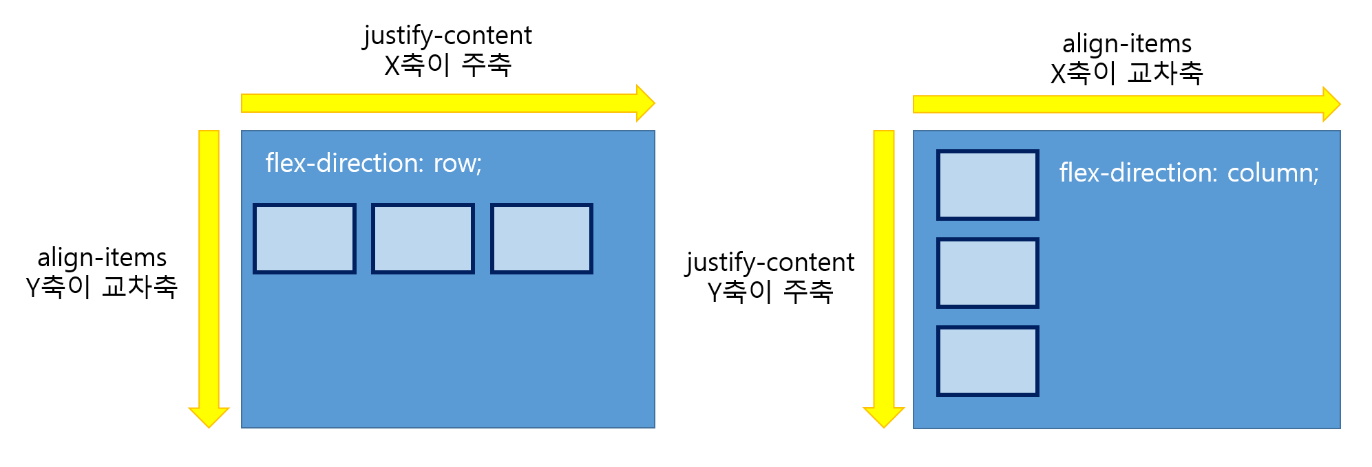
flex가 적용된 부모 요소 내에 자식 요소의 주축 정렬 설정 | |
flex-direction 상태 |
row : x축, column : y축 | |
flex-start |
왼쪽 정렬 | |
flex-end |
오른쪽 정렬 | |
center |
중앙 정렬 | |
space-around |
요소들의 양 옆 여백을 동일하게 적용 | |
space-evenly |
박스 내 모든 요소의 여백이 동일하게 적용 | |
space-between |
양 옆 여백 없이 양 끝 정렬 | |
flex-wrap |
줄바꿈 설정 | |
wrap |
content가 너비를 넘어가면 자동 줄바꿈 | |
| 높이 = (부모높이/줄수) | ||
nowrap |
줄바꿈 없음 | |
wrap-reverse |
자동 줄바꿈+역순 | |
flex-flow |
flex-direction과 flex-wrap을 동시에 설정 | |
row nowrap |
기본값 | |
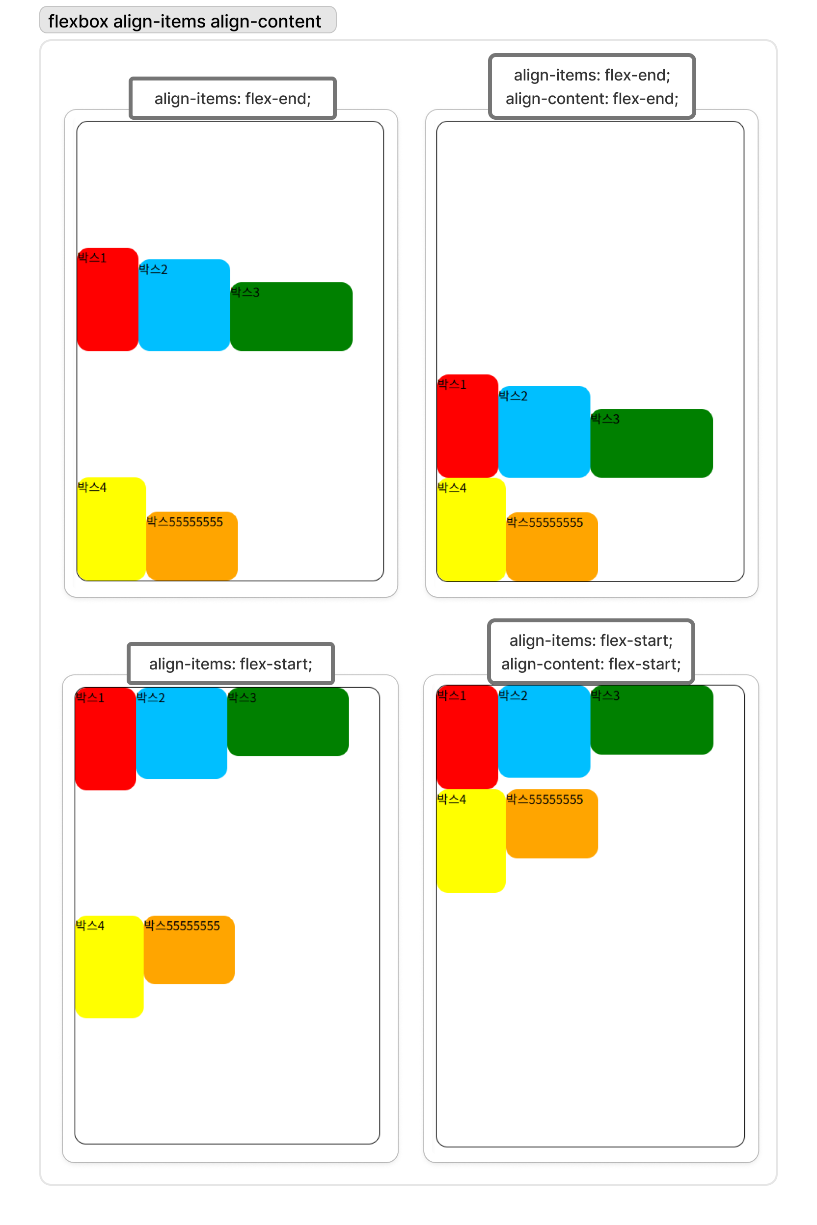
align-items |
flex가 적용된 부모 요소 내에 자식 요소의 교차축 정렬 설정. 컨테이너 내에서 items들의 배치를 지정 flex-direction 상태에 따라 (row -> y축, column -> x축)로 결정 |
|
flex-start |
위쪽 정렬 | |
flex-end |
아래쪽 정렬 | |
center |
가운데 정렬 | |
baseline |
글자들의 위치를 기준으로 정렬 | |
first baseline |
글자들의 위치를 기준으로 위쪽 정렬 | |
last baseline |
글자들의 위치를 기준으로 아래쪽 정렬 | |
align-content |
flex가 적용된 부모 요소 내에 자식 요소가 두 줄 이상일 때 요소들의 교차축 정렬 설정 컨테이너 내에서 item의 줄 간격을 지정하기 때문에 아이템이 한 줄이라면 적용되지 않음 flex-direction 상태에 따라 (row -> y축, column -> x축)로 결정 |
|
flex-start |
위쪽 정렬 | |
flex-end |
아래쪽 정렬 | |
center |
가운데 정렬 | |
baseline |
글자들의 위치를 기준으로 정렬 | |
first baseline |
글자들의 위치를 기준으로 위쪽 정렬 | |
last baseline |
글자들의 위치를 기준으로 아래쪽 정렬 | |
align-self |
요소를 개별 정렬할 때 사용 | |
place-content |
justify-content와 align-content를 동시에 지정 | |
| justify-content의 속성값 align-conten의 속성값 순서로 기재 | ||
order |
n |
flex box나 grid container 내의 현재 요소의 배치 순서를 지정 |
| 값이 클 수록 아래쪽에 배치되고, 값이 같다면 소스코드 순서로 정렬 | ||
| 화면에 보이는 순서에만 영향을 주기에 비시각 매체에는 사용하지 않는게 좋음 | ||
gap |
요소 사이의 간격 지정 |
예제 코드
<!DOCTYPE html>
<html lang="en">
<head>
<meta charset="UTF-8">
<meta name="viewport" content="width=device-width, initial-scale=1.0">
<title>Document</title>
<link rel="stylesheet" href="../css/layout-2.css">
</head>
<body>
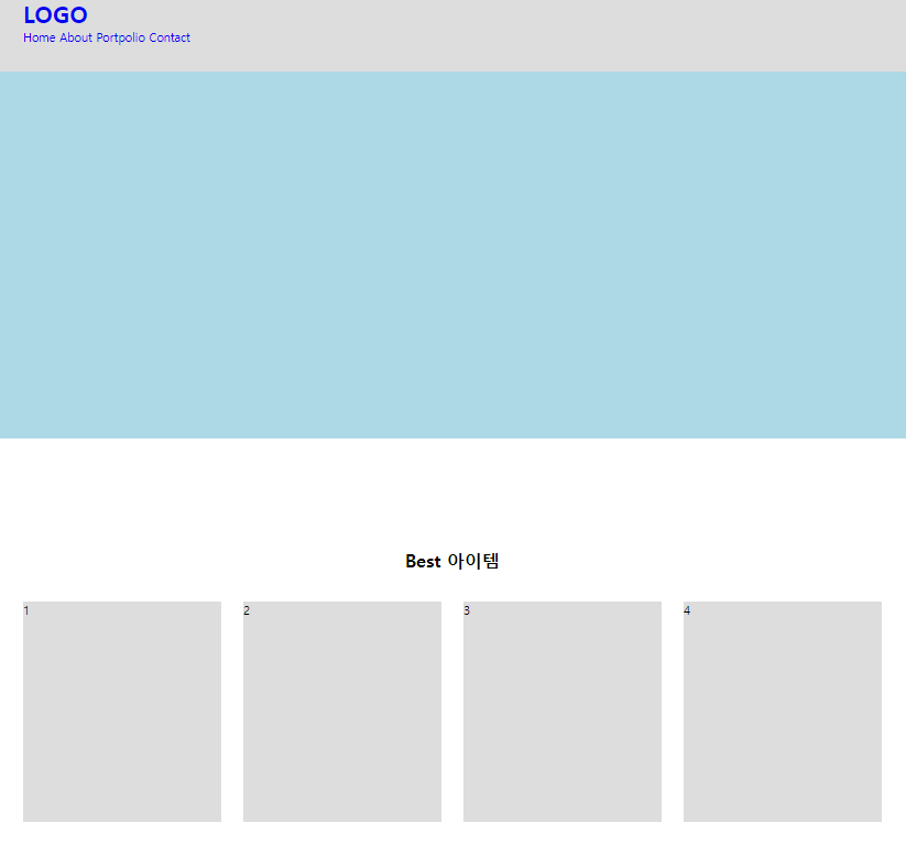
<header class="header">
<div class="inner">
<h1 class="logo"><a href="#">LOGO</a></h1>
<nav>
<a href="#">Home</a>
<a href="#">About</a>
<a href="#">Portpolio</a>
<a href="#">Contact</a>
</nav>
</div>
</header>
<main>
<section class="visual"></section>
<section class="bestItem content">
<div class="inner">
<h2 class="title">Best 아이템</h2>
<div class="wrap">
<div class="box">1</div>
<div class="box">2</div>
<div class="box">3</div>
<div class="box">4</div>
</div>
</div>
</section>
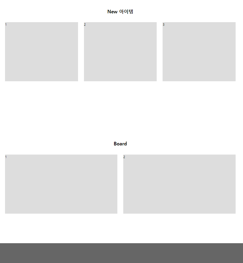
<section class="newItem content">
<div class="inner">
<h2 class="title">New 아이템</h2>
<div class="wrap">
<div class="box">1</div>
<div class="box">2</div>
<div class="box">3</div>
</div>
</div>
</section>
<section class="board content">
<div class="inner">
<h2 class="title">Board</h2>
<div class="wrap">
<div class="box">1</div>
<div class="box">2</div>
</div>
</div>
</section>
</main>
<footer class="footer"></footer>
</body>
</html>
*{margin:0;padding:0; box-sizing: border-box;}
ul, ol, li{list-style: none;}
a{text-decoration: none;}

.header{width: 100%; height: 100px; background-color: #ddd;}
.inner{width:1170px; margin:0 auto;}

.content{width:100%; padding: 150px 0;}
.content .title{margin-bottom: 40px; font :bold 24px 'inherit'; text-align: center;}
.content .wrap{display:flex; flex-direction: row; justify-content: space-between;}
.content .box{height: 300px; background-color: #ddd;}

.visual{width: 100%; height: 500px; background-color: lightblue;}

.bestItem .box{width: 270px; }
.newItem .box{width: 370px; }
.board .box{width: 570px; }

.footer{width: 100%; height: 100px; background-color: #666;}
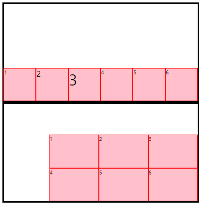
<!DOCTYPE html>
<html lang="en">
<head>
    <meta charset="UTF-8">
    <meta name="viewport" content="width=device-width, initial-scale=1.0">
    <title>Document</title>
    <style>
        .container{
            width: 600px; height: 300px;
            margin: 0 auto; border: 5px solid black;
            display: flex;
            flex-direction: row;
            align-items: center;
        }

        .box{width: 150px; height: 100px; background-color: pink; border: 1px solid red;}

        .wrap{flex-wrap: wrap; justify-content: flex-end; align-content: flex-end;}
        .nowrap{flex-wrap: nowrap; justify-content: flex-end; align-items: flex-end;}
    </style>
</head>
<body>
    <div class="container nowrap">
        <div class="box">1</div>
        <div class="box" style="font-size: 24px;">2</div>
        <div class="box" style="font-size: 48px;">3</div>
        <div class="box">4</div>
        <div class="box">5</div>
        <div class="box">6</div>
    </div>
    <div class="container wrap">
        <div class="box">1</div>
        <div class="box">2</div>
        <div class="box">3</div>
        <div class="box">4</div>
        <div class="box">5</div>
        <div class="box">6</div>
    </div>
</body>
</html>