Footer 하단에 고정하기
✒️ 2025-05-16 12:37 내용 수정
- 팀 프로젝트를 진행하면서 Footer를 페이지 하단에 고정할 필요가 있어 이를 검색해 수정했다.
- 참고 자료에선 position relative를 사용한 방법이 있는데, 프로젝트에선 React를 사용했고, Component들의 구조상 적용이 어려울 것 같아 display flex를 사용하는 방법으로 변경했다.
- 참고 자료 : Gomi's footer 하단 고정
React 구조에 적용하기
- 먼저 React의 App.js에선 구조를 다음과 같이 작성했다.
- 모든 영역을 감싸는 div를 추가한다. (
app-wraper) <Header/>와<Footer/>를 제외한 다른 Component를 감싸는 div를 추가한다. (content-wraper)<Header/>는 className이header인 태그를,<Footer/>는 className이footer인 태그를 가지고 있다.
- 모든 영역을 감싸는 div를 추가한다. (
import Header from './components/Header.js';
import Footer from './components/Footer.js';
import Main from './pages/Main.js'

function App() {
	return (
		<div className='app-wrapper'>
			<Header/>
			<div className='content-wrapper'>
				<Routes>
					<Route path="/" element={<Main/>}/>
				</Routes>
			</div>
			<Footer/>
		</div>
	);
}

export default App;
- 가장 큰 div인
app-wrapper의 경우display: flex와flex-direction: column을 적용하여 하위 태그들이 세로로 쌓이도록 적용한다.- 위치 및 표시 속성 참고.
.app-wrapper{
	display: flex;
	flex-direction: column;
	min-height: 100vh;
}
- 내부 div인
content-wrapper의 경우flex: 1을 적용하여 Flex container 내의 모든 남은 공간을 균등하게 나누어 차지하도록 설정한다.flex: 1은flex-grow,flex-shrink,flex-basis속성을 한 번에 설정한다.flex-grow: 1: Flex container 내 아이템이 남은 공간을 차지하도록 확장하며, 다른 아이템들과 공간을 균등하게 나눈다.flex-shrink: 1: Flex container가 작아지면 container 내의 아이템을 필요에 따라 축소 시킨다.flex-basis: 0: Flex container 내의 아이템의 기본 크기를 0으로 설정하여 아이템이 공간을 차지하는 기준을 지정한다.
.content-wrapper{
	flex: 1;
}
- header는 뷰포트 상단에 항상 고정시키기 위해
position: sticky를 적용한다.
.header{
	position: sticky; top: 0px;
	padding: 4px 0;
	background-color: white; z-index: 1000;
}
- footer는 다른 component과 겹치는 것을 방지하면서 적당한 간격을 두기 위해
margin만 설정했다.
.footer{
	margin-top: 50px;
}
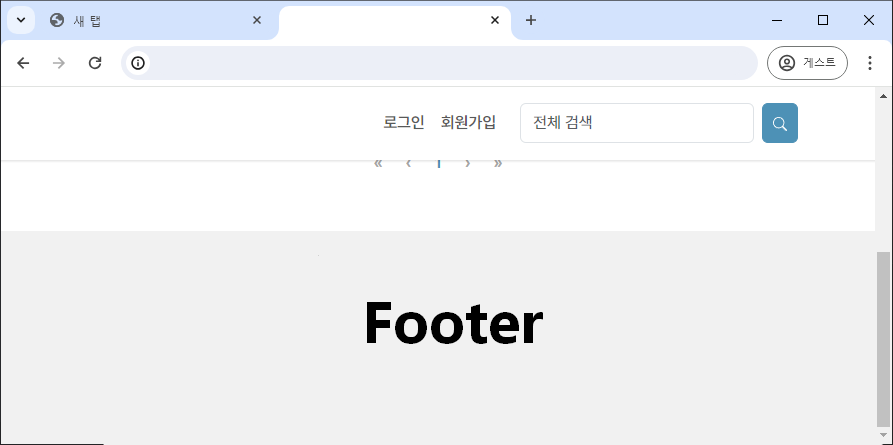
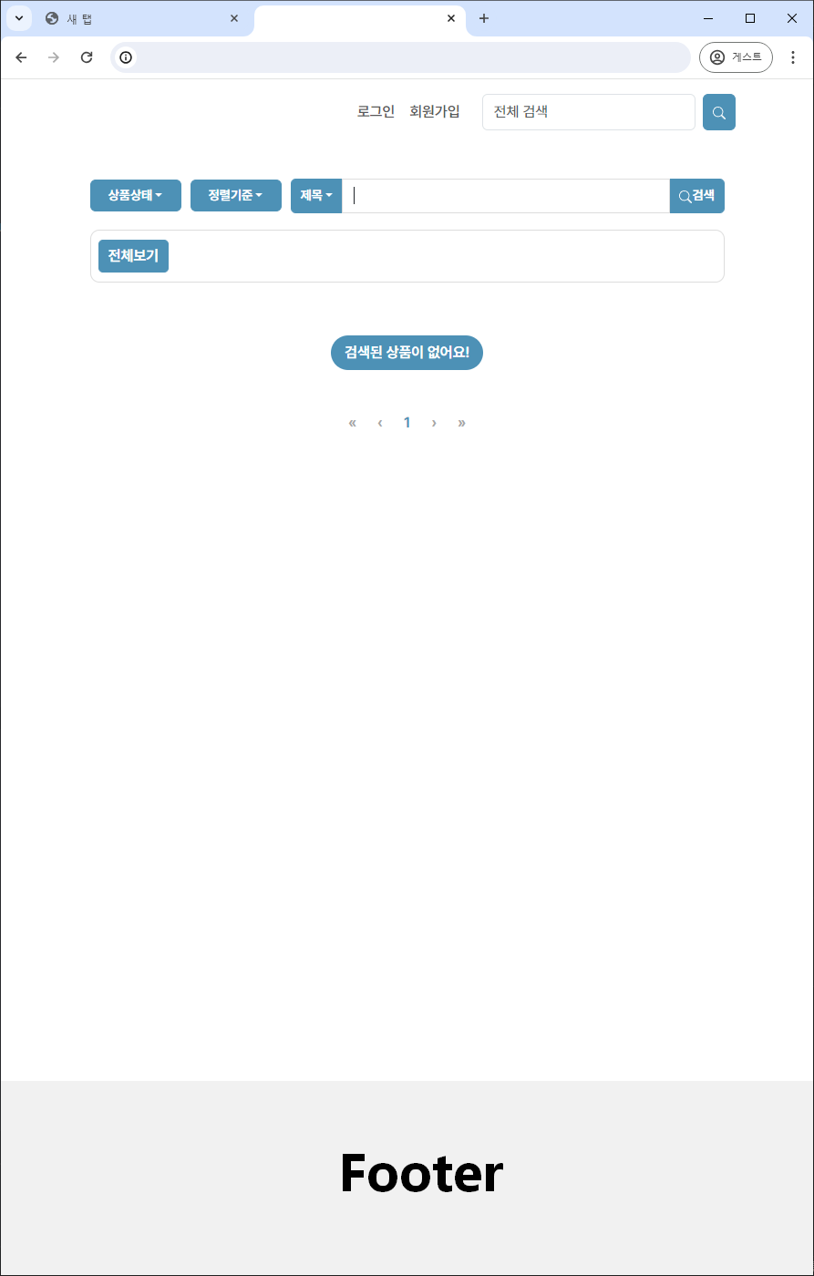
- 중간의 내용물들이 없어서 높이가 충분하지 않아도 페이지 하단에 Footer 영역이 고정된다.
- 뷰포트 하단에 고정되는 것이 아닌 페이지 하단에 고정된다.
- Header에는
sticky옵션을 줘서 스크롤을 내려도 뷰포트 상단에 고정되도록 할 수 있다.