이스트캠프 HTML CSS 퀴즈 3
📘 오늘 학습한 내용
1️⃣ Flexbox
2️⃣ Grid layout
3️⃣ 배경과 이미지
4️⃣ 미디어 쿼리
5️⃣ 애니메이션과 트랜지션
📝 퀴즈
🧩 퀴즈 1
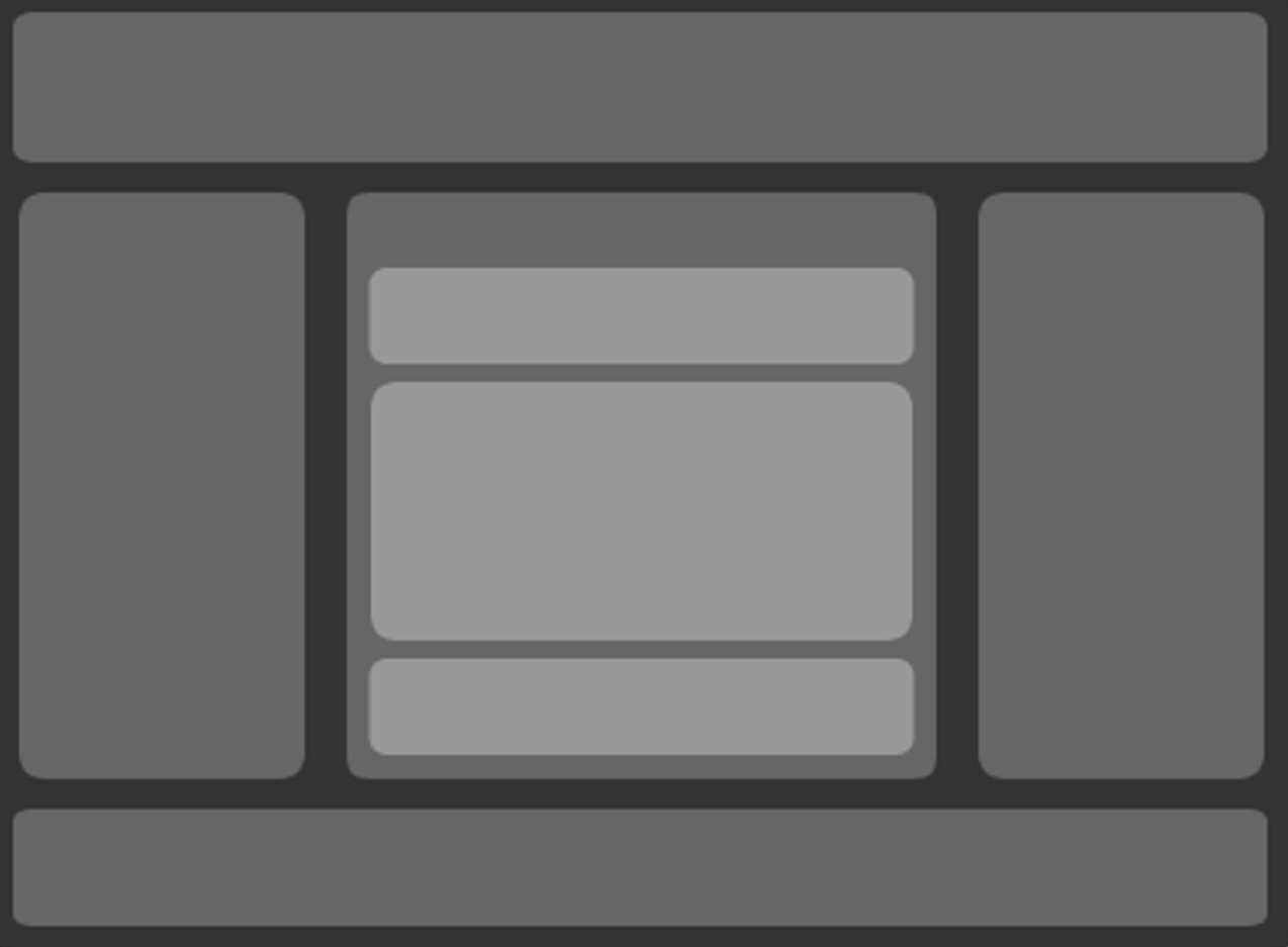
Q. html 시맨틱 태그, div태그와 오늘 배운 flex속성을 이용하여 아래 그림과 같은 구조를 만들어보세요.
📝 나의 답변:
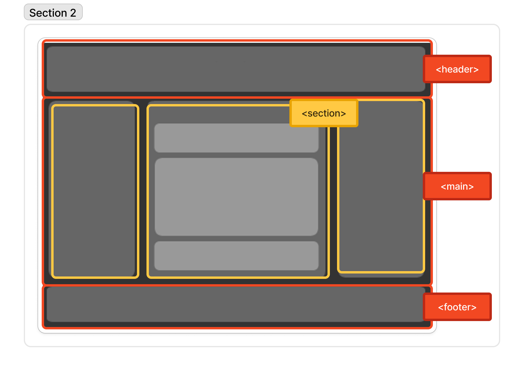
- HTML
<header>
<p><header></p>
</header>
<main>
<section id="left">
<p><section></p>
</section>
<section id="center">
<p><section></p>
<div class="box">
<p><div class="box"></p>
</div>
<div class="box" id="mid">
<p><div class="box"></p>
</div>
<div class="box">
<p><div class="box"></p>
</div>
</section>
<section id="right">
<p><section></p>
</section>
</main>
<footer>
<p><footer></p>
</footer>
- CSS
- 높이는 임의로 지정하였다.
/* 설정값 */
:root{
	--div-gray: #636363;
	--div-gray-l: #bbbbbb;
}
*{box-sizing: border-box; margin:0; padding:0;}

/* body */
body{
	display: flex;
	flex-direction: column;
	justify-content: center;
	align-items: center;
	background-color: rgb(44, 44, 44);
	position:relative;
	font-size: 20px;
	font-weight: bold;
	text-align: center;
}

/* semantics 공통 */
header,footer,section, .box{
	display: flex;
	flex-direction: column;
	justify-content: center;
}
header, footer{
	margin: 20px 0;
	width: calc(100% - 40px); height: 150px;
	background-color: var(--div-gray);
	border-radius: 10px;
}

/* main */
main{
	margin: 5px 20px;
	display: grid;
	width: calc(100% - 40px); height: calc(100vh - 340px);
	grid-template-columns: 1fr 2fr 1fr;
	gap: 20px;
}
section{
	background-color: var(--div-gray);
	border-radius: 10px;
}
#center{
	padding: 0 20px 20px 20px;
	display: flex;
	flex-direction: column;
	justify-content: flex-end;
	align-items: center;
}
.box{
	width: calc(100% - 20px);
	height: 100px;
	margin: 10px 0;
	background-color: var(--div-gray-l);
	border-radius: 10px;
}
#mid{
	height: 200px;
}

/* footer */
footer{
	height: 100px;
}
✅ 정답:
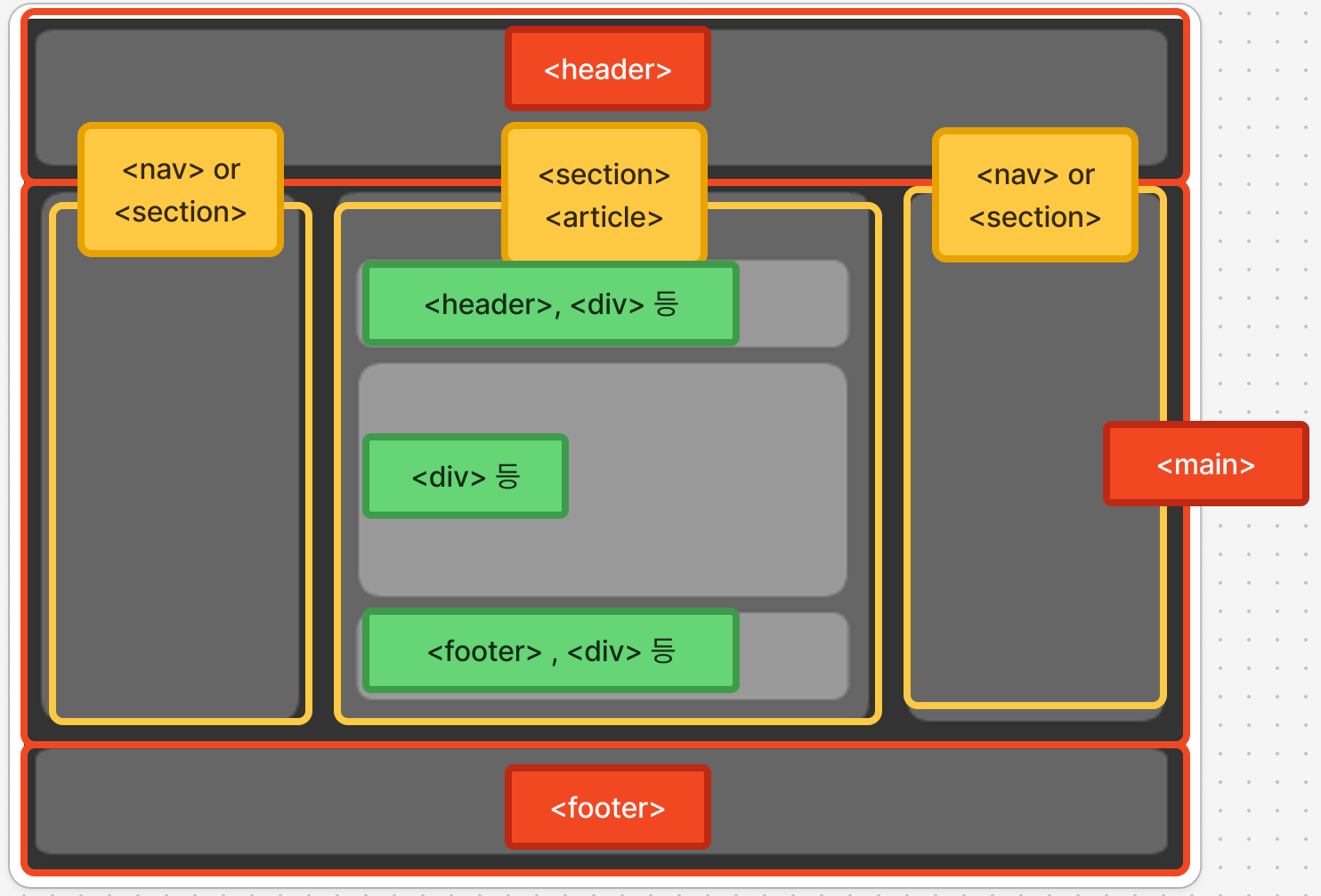
- 시맨틱 코드에서
<header>와<footer>는 구역마다 1개씩 넣을 수 있다.- ex) 문서의 위와 아래의
<header>,<footer> <article>내의<header>,<footer>
- ex) 문서의 위와 아래의
<nav>는 왼쪽이나 오른쪽, 사이트에 따라 상단에 배치할 수 있다.<main>은 반드시 문서 당 1개만 넣어야 한다.
🧩 퀴즈 2
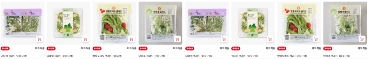
Q. 아래 이미지와 같은 구조를 만들어보세요.
- 상품 이미지에 넣는 이미지는 자유입니다. 이미지가 잘리더라도 기존 이미지의 비율이 변형되서는 안됩니다(늘어나는 것 금지).
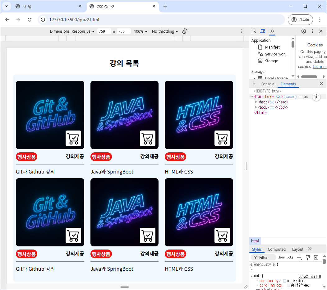
- 768px이하의 브라우저 너비에서는 2줄이 되어야합니다.
📝 나의 답변:
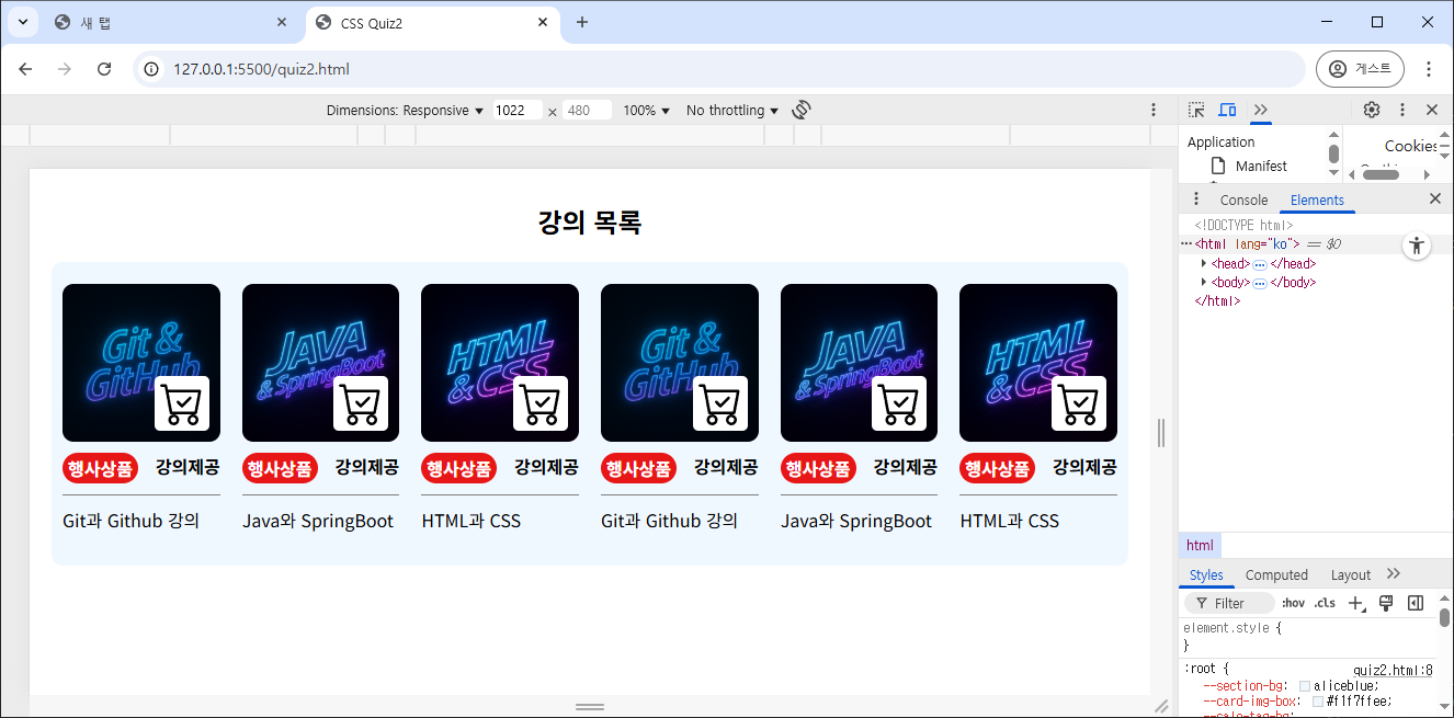
- HTML
<section>
	<h1>강의 목록</h1>
	<div id="card-box">
		<div class="card">
			<div class="img-box">
				<img class="product-img" src="./images/gitgithub.png" alt="gitgithub">
				<img class="cart-img" src="./images/cart-check.svg" alt="cart-check">
			</div>
			<div class="tag-wrap">
				<span class="sale-tag">행사상품</span>
				<span class="ship-tag">강의제공</span>
			</div>
			<div class="info">
				<p>Git과 Github 강의</p>
			</div>
		</div>
		<div class="card">
			<div class="img-box">
				<img class="product-img" src="./images/javaspringboot.png" alt="javaspringboot">
				<img class="cart-img" src="./images/cart-check.svg" alt="cart-check">
			</div>
			<div class="tag-wrap">
				<span class="sale-tag">행사상품</span>
				<span class="ship-tag">강의제공</span>
			</div>
			<div class="info">
				<p>Java와 SpringBoot</p>
			</div>
		</div>
		<div class="card">
			<div class="img-box">
				<img class="product-img" src="./images/htmlcss.png" alt="htmlcss">
				<img class="cart-img" src="./images/cart-check.svg" alt="cart-check">
			</div>
			<div class="tag-wrap">
				<span class="sale-tag">행사상품</span>
				<span class="ship-tag">강의제공</span>
			</div>
			<div class="info">
				<p>HTML과 CSS</p>
			</div>
		</div>
		<!-- 위 카드 항목을 그대로 반복해서 사용 -->
	</div>
</section>
- CSS
- 처음에 Flexbox로 구현했다가 미디어 쿼리에서
margin과width설정으로 인해 2줄이 안되는 현상을 겪어서 Grid Layout으로 교체해서 빠르게 수정했다. - 제출 후 다시 Flexbox로도 구현을 해 보았는데, 상세한 margin을 주기엔 Flexbox가 편하지만, 빠르고 간단하게 구현하는 것은 Grid Layout이 더 편리했다.
- 처음에 Flexbox로 구현했다가 미디어 쿼리에서
/* 기본 설정 및 색상 설정값 */
:root{
	--section-bg:aliceblue;
	--card-img-box: #f1f7ffee;
	--sale-tag-bg:rgb(231, 23, 23);
}
*{box-sizing: border-box; margin: 0; padding: 0;}

/* section */
section{
	margin: 30px 0;
	padding: 0 20px;
	width: 100%;
}
h1{text-align: center;}

/* card box */
#card-box{
	margin-top: 20px;
	padding: 20px 0;
	background-color: var(--section-bg);
	border-radius: 10px;
}

/* card image */
.img-box{
	width: 100%;
	display: flex;
	flex-direction: column;
	align-items: center;
	background-color: var(--card-img-box);
	position:relative;
}
.product-img{
	width: 100%;
	object-fit: cover;
	border-radius: 10px;
}
.cart-img{
	width: 50px; height: 50px;
	padding: 5px;
	border-radius: 5px;
	background-color: white;
	position:absolute;
	right: 10px; bottom: 10px;
}

/* tag */
.tag-wrap{
	display: flex;
	padding: 10px 0;
	justify-content: space-between;
	border-bottom: 1px solid gray;
}
.tag-wrap span{
	font-weight: bold;
}
.sale-tag{
	padding: 2px 5px;
	background-color: var(--sale-tag-bg);
	color:white;
	border-radius: 15px;
}

/* item info */
.info{
	margin: 10px 0;
}
- flexbox로 구현 시
/* card */
#card-box{
	display: flex;
	justify-content: space-evenly;
	flex-wrap: nowrap;
}
.card{
	width: calc((100% - (30px * 5)) / 6);
}

/* meida */
@media screen and (max-width: 768px) {
	#card-box{
		flex-wrap: wrap;
	}
	.card{
		width: calc((100% - (30px * 5)) / 3);
	}
}
- grid layout으로 구현 시
/* card */
#card-box{
	display: grid;
	grid-template-columns: repeat(6, 1fr);
	background-color: var(--section-bg);
}
.card{
	margin:0 10px;
}

/* meida */
@media screen and (max-width: 768px) {
	#card-box{
		grid-template-columns: repeat(3, 1fr);
	}
}